SiteMinder UI redesign
Project Type
Webapp redesign
Date
2024–2025
SiteMinder’s platform has come a long way since work began in 2019. Since launching the new Platform, SiteMinder now has acces to and can be guided by, valuable customer insights which will helps expand their product vision.
I embarked on a comprehensive UI redesign for SiteMinder that enhances their current design system, tells their users who they are as a brand, and optimises current navigation.
Why redesign the UI?
Working on this strategic update reflects SiteMinder’s commitment to applying key learnings from the past five years, ensuring their Platform continues to meet and exceed user needs as they scale their business. SiteMinder has ambitious long term goals and I believe the look and feel of their product is a large part of reaching those goals.
It can be hard to grasp the value of a products UI as it can often be a reflection of the users more visceral reaction to a product. However the UI directly impacts how users interact with Platform, influencing their first impressions and overall experience; a well-designed UI can improve usability, increase user engagement, enhance brand perception, and ultimately lead to higher customer satisfaction and retention by making navigation intuitive and tasks easier to accomplish.
Research
Before exploring any new directions for the look and feel of Platform I needed to ensure that I had a really good picture of how exactly the UI can improve by addressing existing, new and uncovered insights and issues with the current UI.
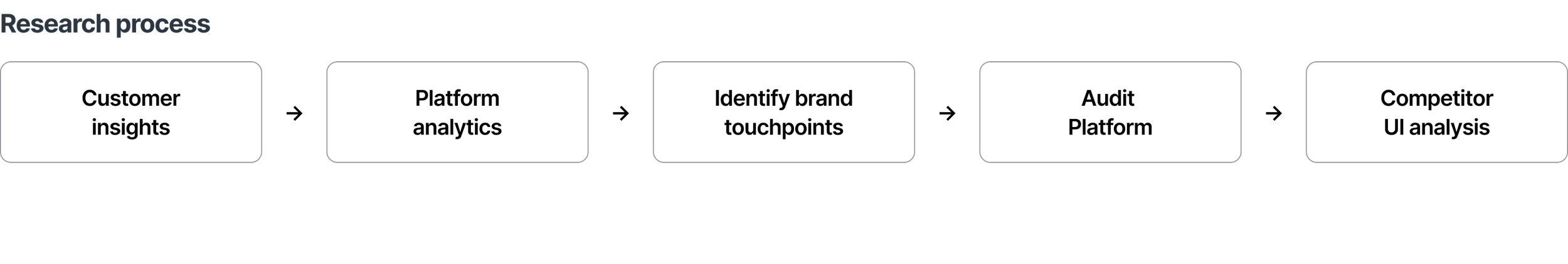
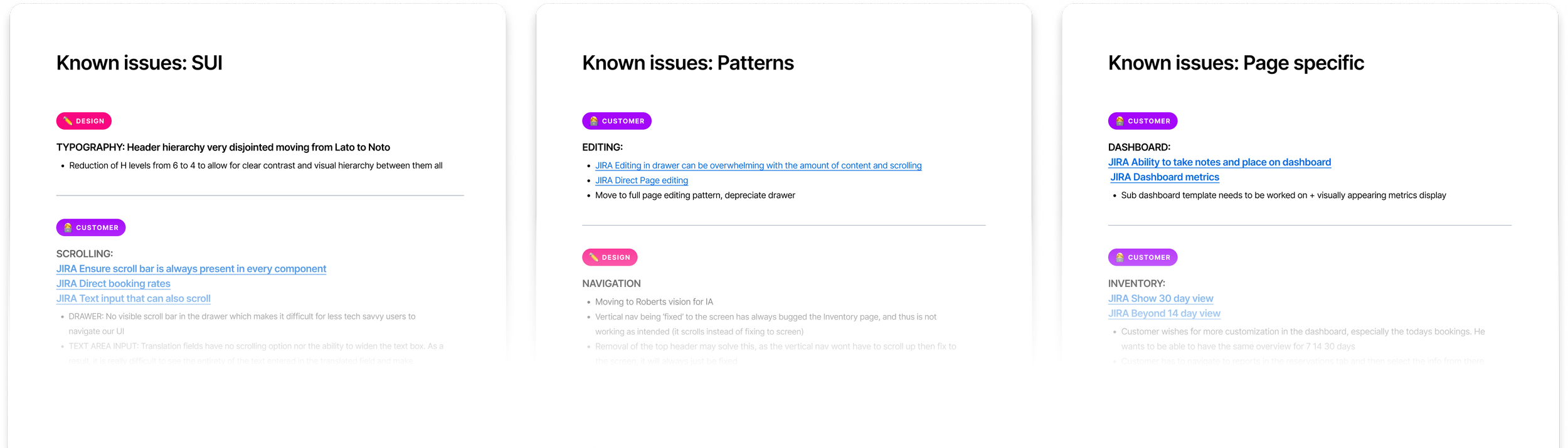
Customer insights
I combed through our archives of customers feedback and insights from the 2019 and identified what would directly help improve the customer experience through the UI uplift.
Platform analytics
Using Heap, I used Platform analytics to discover how our users are accessing the Platform. What devices are they using? What operating systems? What resolution? All of these are important factors in making UI decisions.
Identifying brand touch points
One clear peice of feedback that I was getting from stakeholders, was that there is a lack of branding and brand personality within the Platform. One main reason for this is that the brand was going through a redesign when work on Platform began. We now have a much clearer vision for the SiteMinder brand, so it was important that the Platform redesign reflect that.
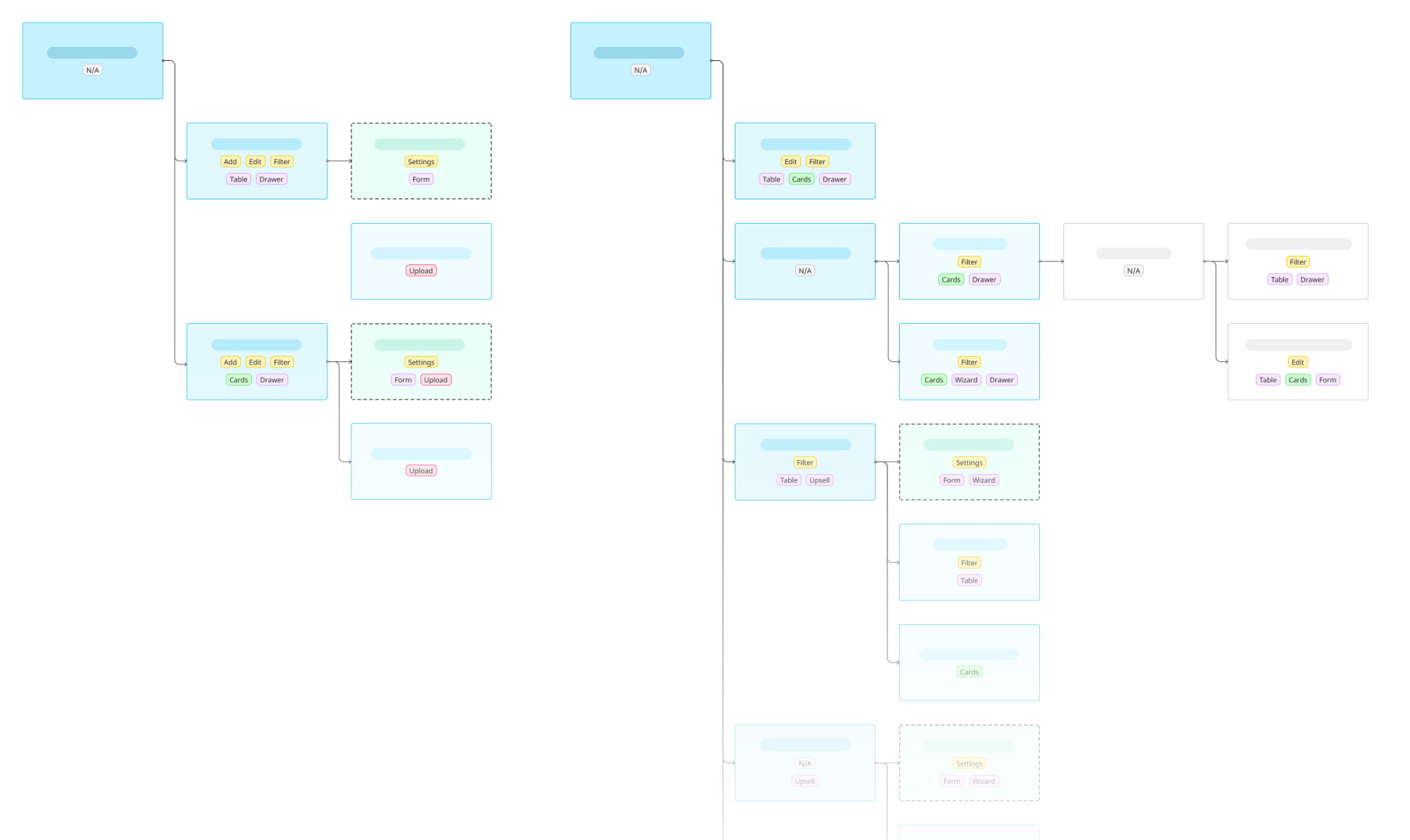
Audit Platform
I did a complete audit of Platform and broke down the each page by functionality. This was paramount to understanding, holistically, the patterns across Platform and what page templates, design patterns and components needed standardising and alignment.
Competitor analysis
I looked at what other SaaS products in the hotelier space are doing, how they are innovating and how Platform measures up against them. However, it’s important to note that while this information is good to know and have access to, the focus should ideally be on the customer, not what the competition is doing.
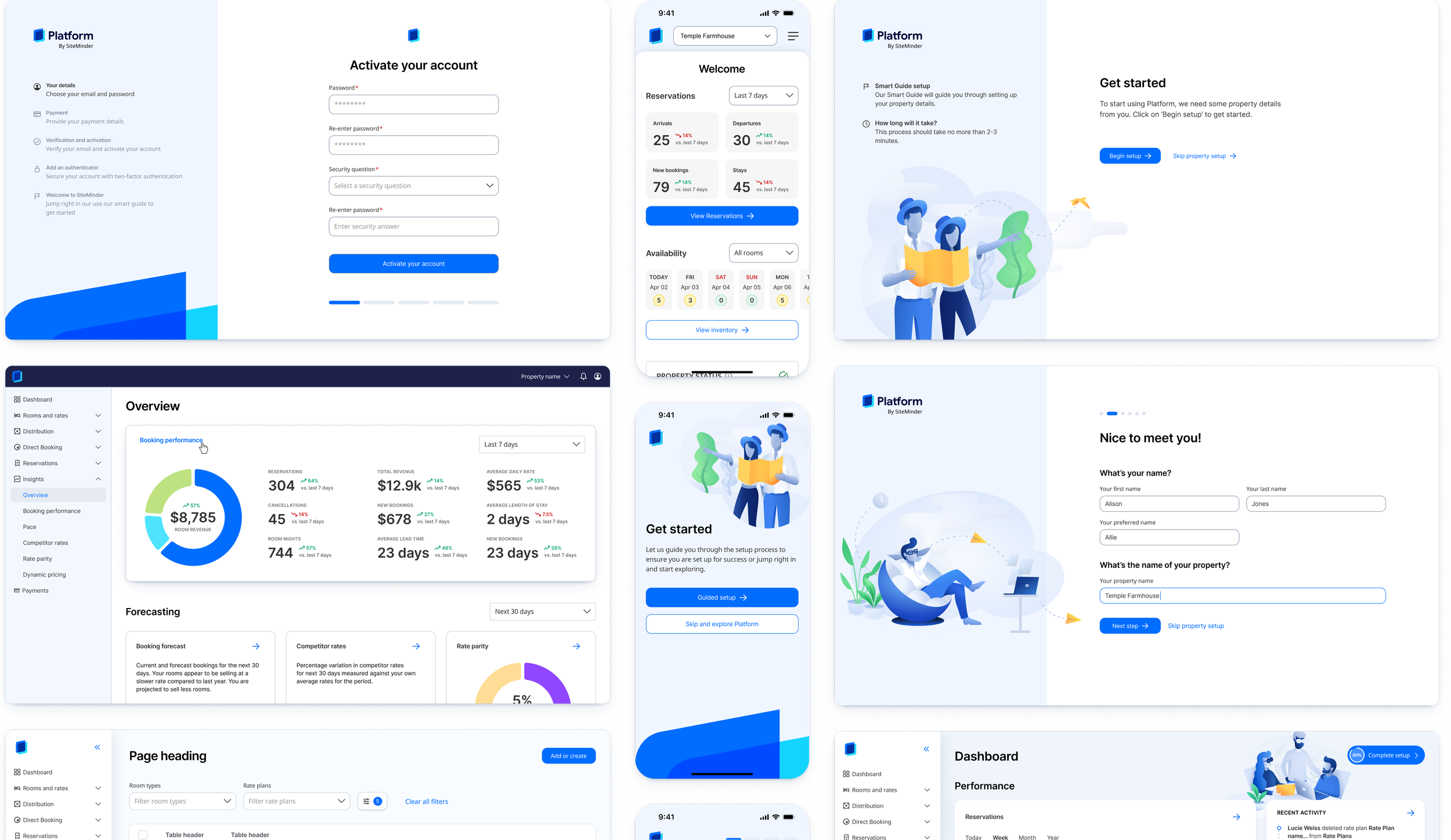
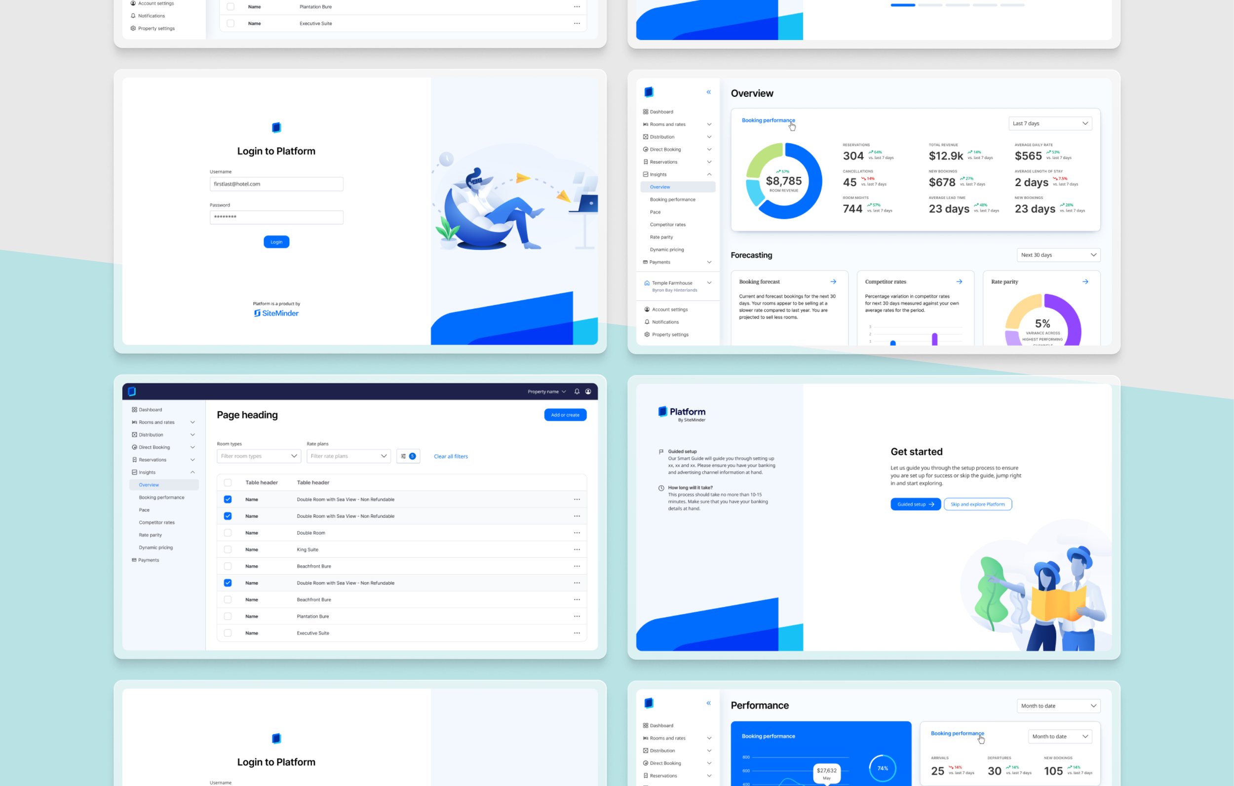
Initial concepts
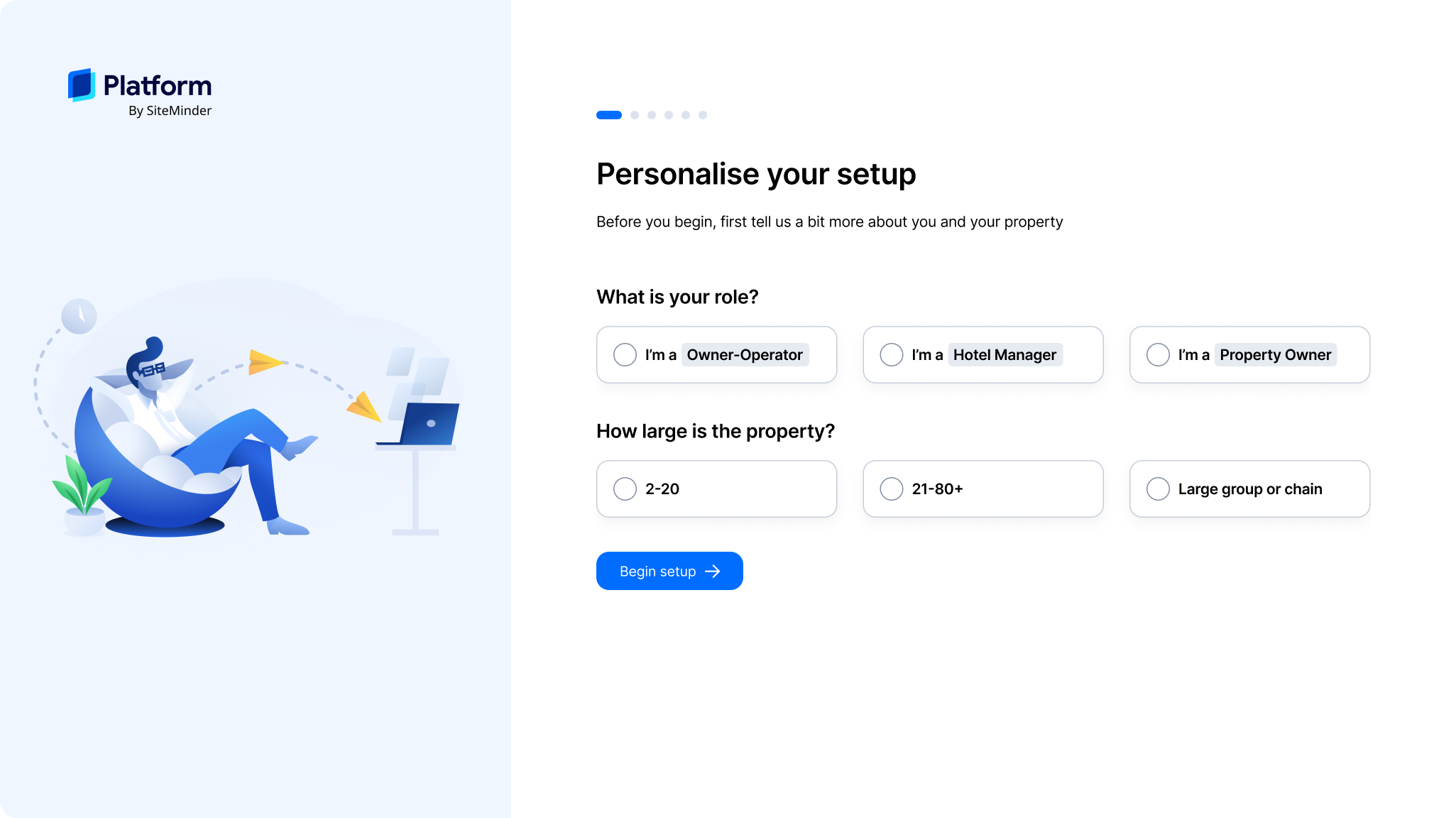
I created a proof of concept of the journey a SiteMinder customer might take from first login/account creation to onboarding and getting started with the Platform.
Onboarding and branding
When doing my competitor analysis, as well as looking at SaaS products in general, one thing that was very apparent was that product branding exists most heavily in the onboarding and first login stage. The onboarding experience for SiteMinder customers is at present, not a good one, so this was a great opportunity to personalise and simplify the experience for customers.
Where to from here?
My process from here would have been to:
Run several UI concept tests with different panels and stakeholders
Iterate and refine, then repeat the above step until designs
Write up a report on the impacts on the current design system and work involved in getting it in place
Approvals with stakeholders and costing
Plan out the roadmap to complete the redesign
However in April 2025 I ended up leaving SiteMinder to pursue a new and exciting opportunity that had come my way. The research and concept iterations that I had done thus far on SiteMinder’s Platform, however, is work that I’m very proud of.
A more in-depth and comprehensive walkthrough of this case study can be done in person or on a call.